An introduction for designers
As a design engineer, I am genuinely optimistic about this development—which is not my usual reflex when it comes to AI-driven interface design.
You might not have heard of A2UI yet. It still lives mostly in developer forums, discussed in code and repositories. However, the core concept is something we need to understand early because it fundamentally changes how we approach frontend architecture.
Let’s start with the core idea rather than the acronym.
Think about how we design interfaces today: we build static screens and deterministic flows aimed at a researched persona. Everyone who visits the app receives more or less the same structure, and we hope it accommodates their specific needs.
With radically adaptive UI (or Generative UI), this relationship is inverted. The interface is assembled dynamically at runtime, custom-tailored to the user’s immediate intent. For example, instead of opening a banking app and navigating through generic dashboards to find transaction details, you simply ask: “Where did my money go this month?” The app immediately renders the exact component you need—a simple category breakdown chart with unexpected expenses flagged—and then recedes.
This is Generative UI or radically adaptive UI. While the specification is young and many implementations are still in the prototype phase, it is already driving production experiences and moving fast enough to warrant our attention.
A2UI (Agent-to-UI) is the protocol that makes this coordination possible. It is not an application or a visual editor; it is a shared language sitting between the AI agent and your interface. When you use A2UI, you are building your frontend app to speak it. Originally initiated by Google and open-sourced to the community, it is being shaped alongside specs like CopilotKit, A2A, and AG-UI.
It is not the only specification emerging. We are also seeing options like Vercel’s json-render and MCP-UI, but we can focus on A2UI as a prime example of this architecture.
Why am I optimistic
It moves us away from unconstrained AI-generated layouts. Early generative demos often produced “div soup” with bloated inline styles and non-standard HTML. A2UI, however, enforces a deterministic constraint: the AI model can only build layouts from a predefined catalog of components.
The reason is simple: every element in this catalog is designed, developed, and tested in clean code with solid CSS, proper state management, and built-in accessibility.
The interface is assembled dynamically for each unique request, but it is built exclusively from these safe, high-fidelity components. This represents a significant shift: our target changes from a static “average user” persona to an interface that adapts to the user’s actual, immediate context.
This is our new homework as designers
To design for this paradigm, we must understand its mechanics. Not in low-level code detail, but in terms of component APIs, design tokens, and serialized component schemas.
Because developers are currently driving how these specs work, design engineers need to take an active role in defining these contracts. Let’s translate the official, code-heavy JSONL stream diagrams of A2UI into a visual walkthrough.
First: What the user actually experiences
Let’s use an example of a hotel booking experience. The adaptive panel can live within a chat sidebar, a mobile view, or stand as the main application layout itself.
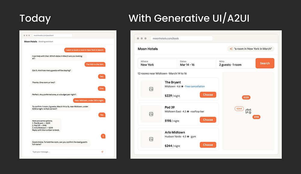
User experience today (June 2026)
In a typical chat interface, booking a hotel in New York requires a rigid, sequential questionnaire: the bot asks for dates, then guests, then room details, one prompt at a time. It mimics a tedious phone call and creates friction at every step.
User experience with radically adaptive UI like A2UI
When the user says “I want a room in New York in March,” the system bypasses the chat sequence and immediately projects the interface they need: a date-range calendar picker with visible pricing flexibility, and a stepper to configure guest count. If the query had been “What hotels are available?”, it would have rendered a high-fidelity photo grid instead.
For the user it is simply this: I ask, and I get exactly the screen I need. Nothing else.
To explore this interaction firsthand, Southleft provides an active demo tool by Southleft showing real-time rendering.
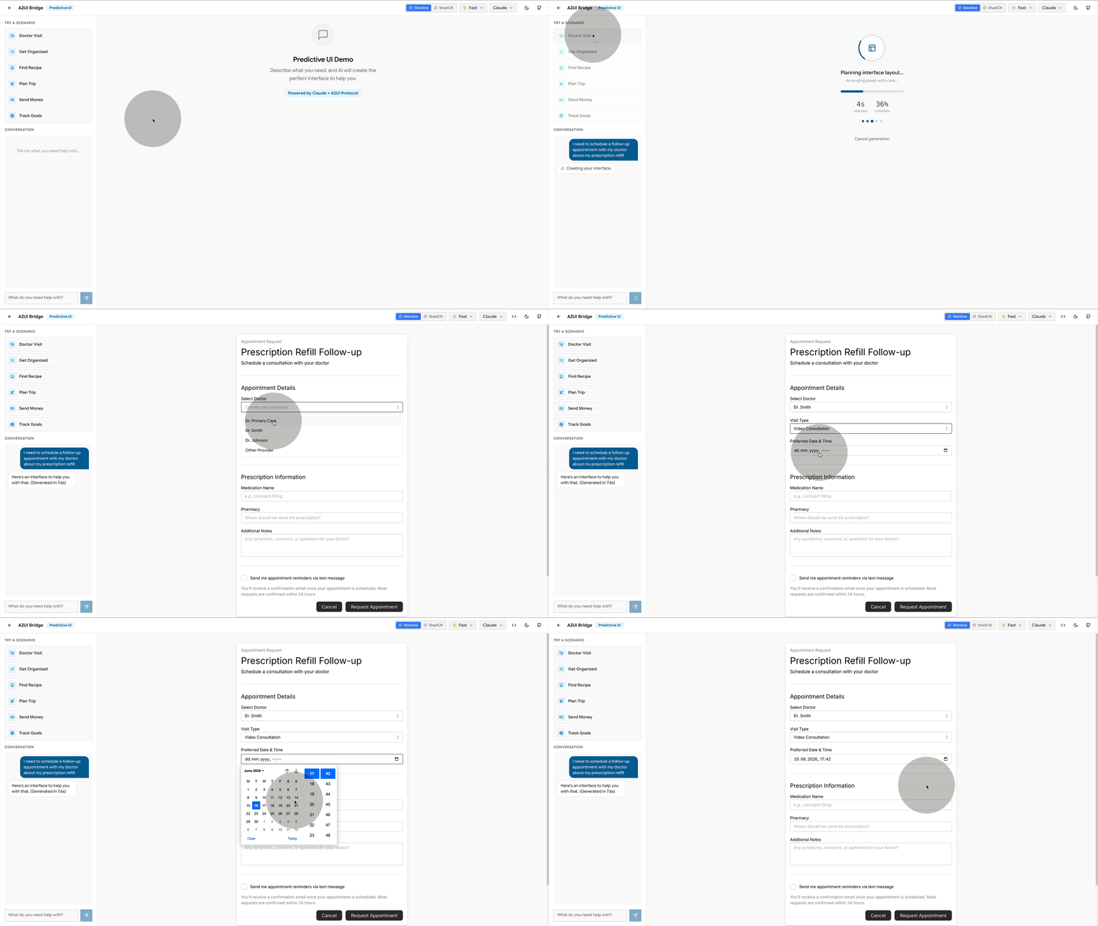
How it works under the hood
The system coordinates between two primary layers:
- The Agent: Running on the server, the agent parses user intent and compiles a layout “recipe” using the component catalog.
- The Renderer: Running on the client, the renderer parses the recipe and instantiates the matching local design system components.
The layout recipe is written dynamically in response to the user’s input, referencing only the component names and APIs exposed in the catalog.
Ok so how does that work step by step?
If you look at the official diagram on A2UI page, the flow can look intimidating. Let’s simplify the architecture step-by-step.
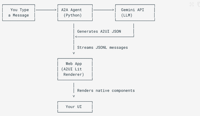
Let’s make it designer-friendly, shall we? Here we go:
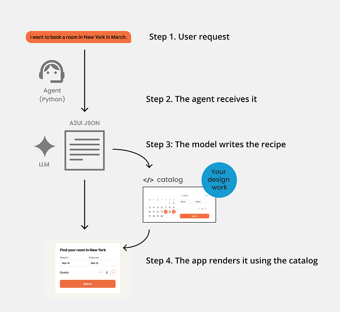
Let’s run through it step by step.
Step 1. You ask
The user issues a natural language request, such as: “I want a room in New York in March.”

Step 2. The agent receives it
A server-side program (often built in Python using the A2UI Agent SDK) bundles the user’s text query alongside your catalog schema and instructions, passing the combined context to the AI model.
Step 3: The model writes the recipe
The LLM (such as Gemini) returns a structured JSONL layout recipe defining the component hierarchy and bindings:
{ "version": "v0.9",  "createSurface": { "surfaceId": "hotel-booking",    "catalogId": "https://moonhotels.com/catalog/v1/catalog.json" } }
{ "version": "v0.9",  "updateComponents": { "surfaceId": "hotel-booking", "components": [    { "id": "root",   "component": "Column", "children": ["title","dates","guests","search"] },    { "id": "title",  "component": "Text", "text": "Find your room in New York", "variant": "h1" },    { "id": "dates",  "component": "DateRangePicker", "value": { "path": "/booking/dates" } },    { "id": "guests", "component": "Stepper", "label": "Guests", "value": { "path": "/booking/guests" } },    { "id": "search", "component": "Button", "variant": "primary",      "action": { "event": { "name": "search_hotels" } } }  ] } }
You do not need to read JSON fluently to see it. Each line names an existing element or component (a Column, a Text heading, a DateRangePicker, a Stepper, a Button) and a few properties. A parts list with an arrangement.
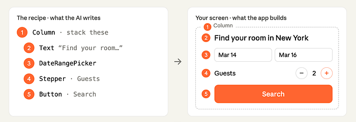
Here is the bit that should make a designer sit up. The model can only name components that exist in the catalog.
It does not invent a date picker, and it does not generate a random one-off widget. A2UI checks the recipe against the catalog before it is sent and catches any property the model tried to make up. The app checks it again on arrival. No more generic…well, you name it.
So “it cannot invent” is not a hopeful promise. The agent generates, a validator checks it against your catalog, and it self-corrects before anything reaches the screen.
That constraint is the whole point, because it hands the next step entirely to us.
Step 4. The app renders it using the catalog
The renderer, the user’s app on web, mobile or desktop, reads the recipe and builds the real screen from your catalog and your catalog only!
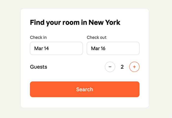
The intelligence decides what to show. Your design system decides what it looks like and how well it works.
Where design comes in
Everywhere that matters! And this is the stuff that excites me after years of generative AI designs running wild in design:
The entire catalog is design decisions. Not a generative free-for-all. Real design thinking, made readable to a machine.
Does the catalog hold styles and tokens, or only components?
Both. The A2UI catalog is defined as the components the agent may use, the functions it may call, and the styles and themes that go with them, plus instructions for using all of it. Your theming and tokens live here too, not just your buttons.
And the components are not only tiny primitives. The catalog can hold a plain Button and Text, but it can just as easily hold a HotelSelector or a FlightCard, a rich, branded component you designed for exactly this product.
You are not handing the machine a box of Lego bricks. You can hand it whole pre-built rooms.
Catalog versus design system
Not the same thing, and the difference is clarifying.
Your design system is the broad human thing: the Figma library, the coded components, the tokens, the docs, the taste behind all of it.
The catalog is the slice you expose to the agent, in a format it can read. The menu it is allowed to order from. The official guidance is to build it to mirror your design system, so the agent is held to your exact components and visual language.
One idea, three layers: the system you think in, the contract you expose, the code that runs.
Where it breaks
Here is the honest part: because the constraint that protects you is also the ceiling. The agent can only name what is in the catalog. So when someone asks for a moment you never designed for, it cannot invent its way out. It does the next best thing, and “next best” is exactly the problem. It reaches for the closest component you did build, even when that is a poor fit. It falls back to the plain, basic set that ships with A2UI, the generic look the whole approach was meant to kill. Or it gives up on a screen entirely and drops back to chat.
And note what the validator does and does not catch. It catches an invented widget or a made-up property. It does not catch bad taste.
A list where a map would have been kinder, a stepper where a calendar was the point, a screen that is technically valid and still wrong. Nothing in the pipeline flags that. The only thing standing between the user and a near-miss interface is whether the catalog had the right piece in it.
So the failure mode is not a crash. It is a quiet downgrade, and it lands on us. Every gap in the catalog is a gap the user feels. That is not an argument against A2UI, it is the clearest possible argument for the job: the screens are only ever as good as what a designer put in the catalog to begin with.
Why this is huge
For years, the careful work, the naming, the states, the tokens, the accessibility, felt like a tax. Worthy, invisible, first to be cut when the time and budget were pressing. Here, that same work becomes the engine. The catalog is the only thing the agent can build from, so the quality of every screen a user ever sees is set by what a designer put in it. Not by a developer interpreting a mockup later. By us designers, upstream, on purpose, into each little element and component.
That is more control over the final outcome than designers have ever really had.
It only works if there is something worth assembling in the first place. Making sure of that is the job.
So what prepare as Designers?
You do not need to learn to write a catalog in JSON. You need to become the person who makes a catalog worth writing.
Whatever an agent reads, we own. In A2UI it is the catalog. In another setup it will carry another name. The label changes, the responsibility does not. The machine builds from a source, and a designer defines the source.
For now, that source still starts in Figma. I do not care what you say: if you do solid design, you need a canvas to think on, otherwise you get the generic stuff I see everywhere (feel free to surprise me). Today, that canvas is Figma.
Here is the part to understand, because it looks like a flaw and it is not. Figma expresses only about a third of CSS cleanly, and that number is not a bug. It covers the third, which is visual and static: layout, type, colour, spacing, and components. The rest of CSS is behaviour, logic and runtime. Focus states, container queries, selectors, interaction, the things that only exist once the page is live and a person is moving through it. So what we hand over is partial by nature, not by failure but that still means it is not ideal.
However, the “then just do not use Figma” is the wrong move in my opinion. You can generate stuff, but if you care about the creative process, you need a tool made for design, not a terminal. The gap is a reason to know Figma’s edges, not to walk away from the canvas. No other tool is built for this either currently, and cramming all of CSS into Figma is not the fix. Designers are already drowning. I spend half my life teaching teams auto layout and props, so trust me, drowning.
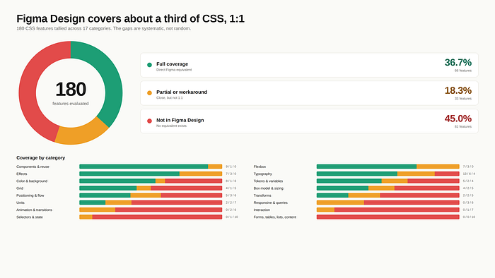
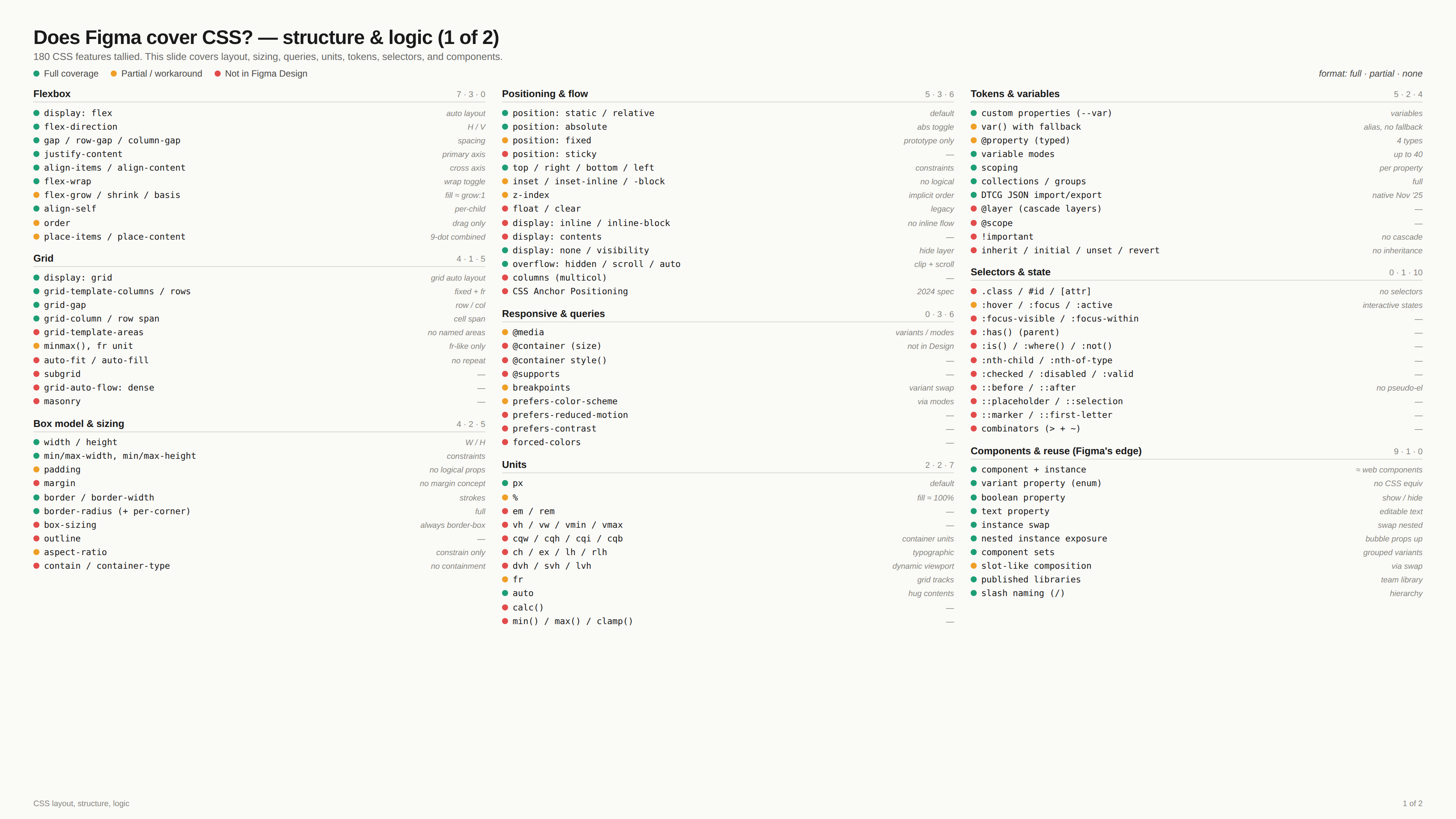
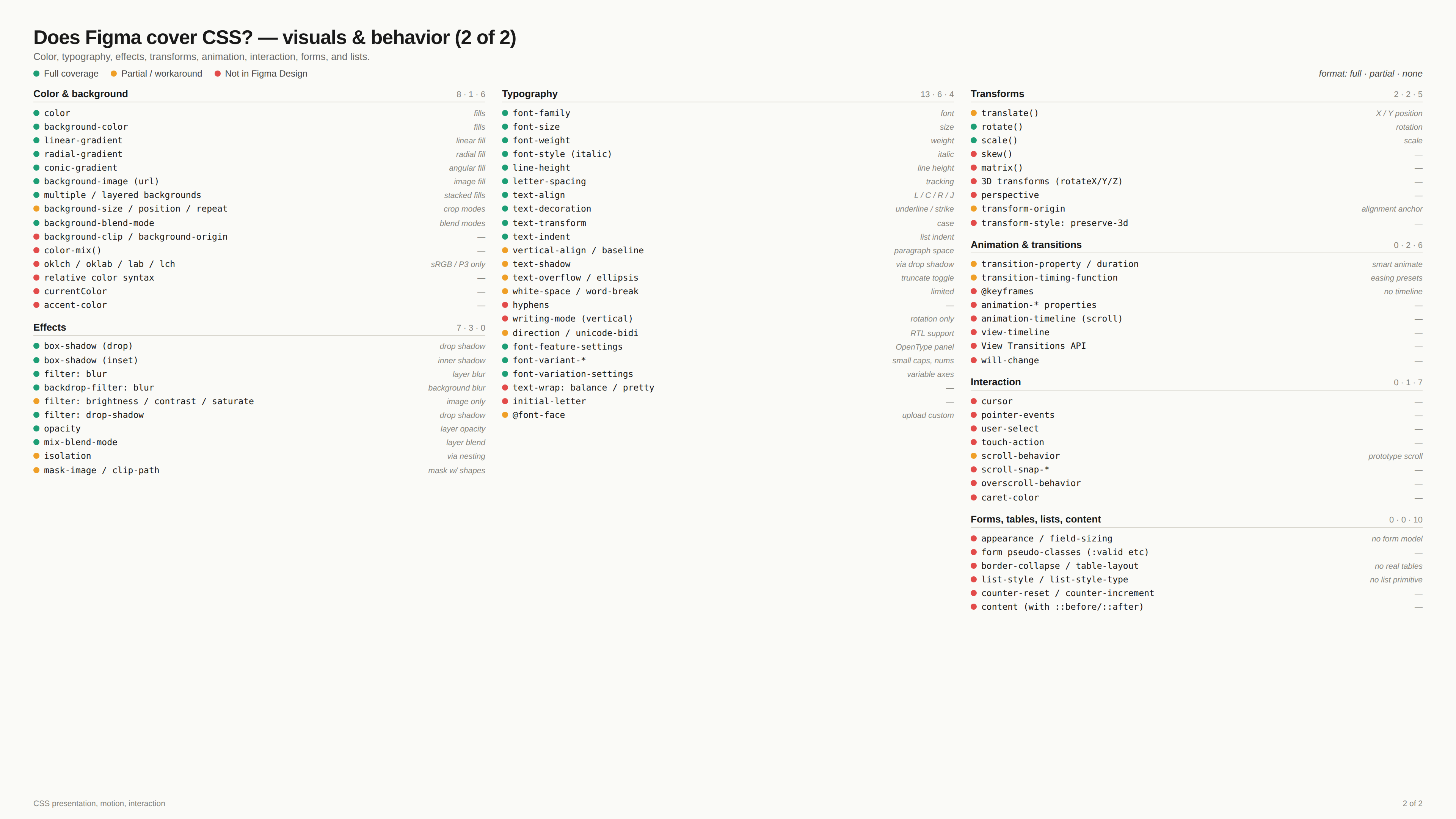
So, concretely, the work for designers is two things.
- Build clean, solid, structured files, the kind that can be read by an agent, can also become a catalog easier in the future: every state designed, semantic tokens that carry intent, names treated as a contract, and a real grip on components, variants, props, and slots, adding context to travel with components, all the features, you now need to know them inside out.
- Then know the gaps. Know where Figma stops and where you need a translation layer or simply a human has to step in, because no tool closes that gap for you today. The catalog like any other agentic design setup today still lives as hand-authored code, just past Figma’s edge, and nobody has built the clean bridge from one side to the other (yet).
So be very critical of anyone who tells you they have a smooth design (real design) to (real) code workflow with AI. Work with agents, absolutely, but make sure the human supervises. The person stays in the seam, on purpose.
Because here is the core of it. Design is thought on a canvas, with your hands, fast and visual, because that is the only way anything but generic comes out. The machine needs the opposite: a precise, structured, machine-readable source. Good design needs the canvas. The agent needs the system. And nothing today carries you from one to the other without losing something on the way. That gap is not a bug waiting for a patch. It is the shape of the problem, and for now, only a person can cross it.
The tool that finally lets a designer think on a canvas or similar creative environment and hand a machine clean-coded elements will decide how everything gets made. I have my fingers crossed for Config 2026.